Sunday, December 5, 2010

The Hurt Locker Analysis

Last week we watched "The Hurt Locker" in film. All I knew to expect was a lot of explosions. I had no idea it would be so intense, though. I really enjoyed it because of the the bigger message it posed toward the end.

I think the director, Kathryn Bigelow, did a really great job as well, which can be seen through he actor's realistic expression and the variety of shots in scenes. This film was released in 2008 and is set in post-invasion Iraq (filmed in Jordan) in an area where there are a lot of bombs and where the American troops settled there are looked at by many with resentment (hence the bombs). It is related to films such as "Inglourious Basterds" because of how there is a group during a war in a specific place just trying to do their jobs for their country (US in both cases). Some thematic ideas I noticed in it were longing, resentment, carelessness, pride, and fear.

The visual style I noticed was that they tried to make it look very realistic with the use of shaky shots, extreme close-ups, casual language and a setting that wasn't too clean. In iconography, I noticed that there were a couple of stray and shabby cats in the beginning. I believe they are symbols of the poverty and loneliness these people are living in. For example, one of the cats is limping, which represents the struggle of many people in this area. Another is not limping, so it may represent the people there who are still struggling but may have it easier than others.


The acting was also very good because the foul language suggests the urgency and authenticity of certain situations, such as when they are looking for the bomb in the car. The Production design was also remarkable because, being set in Jordan just miles from Iraq's border, it looked like it was really in a city in Iraq. The marketplace also gave a very good glimpse of everyday life there.

I think it is formalistic because of the slow motion, multiple angles for significant actions, and ambient music. However, it may be seen as realistic as well because of the almost documentary-like way it's filmed. I like the angles because in every scene there is a shot that we've never seen before, such as from directly above.
I also like the extreme close-ups from the side because they really show how focused the character is. I also like the point of view shots when wearing the suit and mask because it isn't like we're watching the action from afar.
The framing is also nice because it is oftentimes not straight on, but to the side, instead (rule of thirds). I really liked the Canon zoom lenses as well because that added to the shakiness to make it seem like the person filming it is just a bystander with a handheld. The camera vs. actor blocking was oftentimes unique, such as when they are filming something very far away. It's like it's hard for the camera to leave the troops because the cinematographer (which is like a bystander) has the fear of leaving protection and getting close to the enemies far away. The dominant imagery is of bombs and camouflage uniforms because those represent the troops and their mission. The dominant color is beige, as seen with the ground, clothing, and landscape. The bombs are also dominant icons because they are what keep the troops moving close to the enemy. What I also like about the territorial design is the vastness of empty space between, whether out in the open rural area or the road between the troops and the enemies outside or looking outside from their houses or shops. I think it's open form because we also see glimpses of the enemies in their fort or running down the stairs. The only significant or special thing I noticed about the light design were silhouettes: for example, when an Iraqi man is running down the stairs after a bomb is discovered.

I like the silhouettes because they emphasize the strength of the sun in the Middle East.

The editing style is nice because at intense points there are fast cuts, but at others the takes are very slow to emphasize the action. For example, there are fast cuts when the first bomb explodes, but long cuts in the car in search of the bomb. The fast cuts show how such an enormous thing can happen in so little time, while the long cut shows the frustration of searching for the bomb. I like the slow motion of the first bomb exploding because it emphasizes what happened so the viewer has to suffer the action for longer than they really want to. It's especially great when the car implodes and the ground rises because it makes it a less boring way to suffer.


I like the flash forward to when James is in the supermarket because it provides a severe contrast to life in the war. This is a great technique because we're so used to being in Iraq that, like James, we want to go back. It makes normal life look bland. The parallel action is also good, such as when James is searching for the bomb and the Iraqi man is running downstairs, because it adds another perspective to the film. The montage of the first bomb exploding is amazing because it really sends the message that everything is going to be different now, and it is when James arrives.

For he most part, there is ambient music, which I don't think is all that special. What I do like, however, is that they add some slow Arabic music at some intense moments, such as when James is in search of his first bombs with Bravo company and when the Iraqi man is running downstairs. That definitely helped complete the setting.


A repeated motif was the sounds of breathing, such as when James is wearing the bulky suit with the mask. I think it represents the hard work that goes into their job as well as the intensity of the climate in Iraq. In particular, I liked the sounds in the car when James is looking for the bomb because it is realistic and hearing nothing but that heightens our awareness of the urgency of the situation. There are synchronous sounds that add to the realism of the film and compliment the shakiness and random zooms.

The narrative structure is that something important happens to change the lives of some people and they have to live with that change, eventually adjusting to that change. From that point we learn about the background of that change and how it influences them in the current situations. There is a climactic moment and then everything is back to normal, until the "change" can't deal with everything being normal again, so they go back to what they are used to. I like this style because at first it seems like the story is about Sanborn and someone new just pops up, but as the story goes on we realize it's more about James. I think the movie is character driven because it's mostly what James does that leads to certain actions, such as chasing after an enemy causes Eldridge to get shot and sent home. The nature of the dialogue is very much how I expected of these army guys. There's a lot of swearing, with adds to the authenticity of it. I like the irony at the end when James is in the supermarket because it's also humorous when not looked at more deeply. James knows exactly how to look for and disassemble bombs, but he can't even decide what kind of cereal to get. It also contrasts highly to his previous living conditions because there isn't as much choice in that poverty-stricken town.


I also think it's funny because of how James is so careless, while Sanborn is very anxious and cautious. At the same time, though, we are worried about James.

An obvious genre is war because it's about troops and their lives in Iraq. Another genre is dramatic, which can be seen at the end when the man has the bomb attached to himself and he is begging for James to take it off, but James cries that he can't do it in time. Another genre I noticed was suspense because we don't know whether or not someone will die any second or whether or not James will find the next bomb and disassemble it in time. Yelling from Sanborn and others also adds to this because it increases the anxiety. One last genre is action for the obvious aspects of gunfire and violence. This film also subverts the suspense genre because after hearing of James' bomb record (873!), we expect him to find the bomb next time and we put our faith in him. However, this suspense is brought back when the man has the bomb with a timer. I don't believe the war genre is ever subverted throughout the film because "war is a drug" and is therefore always on the mind of James. The dramatic genre is subverted at the end when JAmes is back home because everything seems easygoing and calm at last. The action genre is also subverted at this point because I believe it's the calm before the storm since James decides to go back to war.

Overall, I loved the movie for the shaky camerawork, good acting, Arabic music, irony at the end, and the story line.


Monday, November 15, 2010

Jen&Jen's Fencing Short Documentary Treatment

In class we watched the documentary "Baraka"and student-made short documentaries. This led Mr. Bigue to have us do our own short documentaries as a final project. Being a fencer, I really wanted to do one on fencing because it's something not a lot of people really understand. It also seemed like a lot of work, so I teamed up with the fabulous Jenevieve Rantisi to come up with the following pre-production.

Purpose: The purpose of this documentary is to inform people about the true life of a fencer and what fencing really is.

Contacts: Peninsula Fencing Academy: Jay Choi (fencing coach) and John Stayner (fencer)

Interview Questions:
  1. What is fencing really?
  2. What kind of protective gear do you have?
  3. What does it take to mentally and physically prepare for a tournament?
  4. How has fencing become such a major part of your life? How big of a part does it play?
  5. Does it stress you out?
  6. If so, why do you continue?
  7. How do you cope with that stress?
  8. How does your coach influence you and what do the coaches try to do for the students?
  9. What goes through your head as you're fencing a bout? After a bout?
  10. How does victory mean to you?
  11. How does it feel to win? To lose?
General Flow:
We are introduced to the head coach talking about what fencing really is. He is at the fencing club on a break from coaching. As they talk, there is a typical class in session. Then there is a private lesson going on. As the coaches talk about protective gear, all of the gear is shown laid out, and then there is fast-motion of a fencer putting it all on.

Now John is introduced introduced. As we learn about the major role fencing plays in his life, we see him enter the club one evening. He is warming up for class by jogging and stretching. We see the clock. Then there is a graphic match of the clock at the time he leaves a couple hours later. Any appropriate broll will be added.

We hear Jay's perspective of what he tries to do for his students, and from John about Jay's influence on him. During this time we see him having a private lesson on the fencing strip while the coach is explaining how to do something. The fencer then does the action.

Next, John talks about how they deal with stress (insert b-roll). He answers talks about why he continues to do what he does (insert b-roll). John tells about his particular case where he got injured, but will continue to fence in the upcoming tournament anyway (insert b-roll).

Now we catch a plane all the way to Milwaukee, Wisconsin, where a national tournament is going to be held. We are introduced to the rather huge venue, where all of the fencers are preparing. At this time, we hear about how John mentally and physically prepares, as we see him warm up before his event.

At last, the fencers are ready to fence, and we see them all dressed up before their bouts begin. We hear from John what it's like to be on the strip, what's going through his head, and what it feels like after a bout. Through the mask, we see his expression on the fencing strip. The two opponents are fencing in slow-motion, but as one of the fencers hits, it cuts back to regular motion. We see a couple of more touches in regular motion.

After the fencing, we see John dressing down as we hear what it means to win or lose to him and how it feels. We zoom out from the fencer and pan to see the entire venue, while the coach says, "And that's what fencing really is." Fin.

Friday, November 12, 2010

"The Victory Over Illiteracy" Short Documentary Review

First of all, the topic of this documentary is really great. A man who couldn't read until he was 26 is now a public figure. This shows that the character they are talking about is important because he can be an inspiration for people who are having hard times in school, which viewers can really appreciate and look up to. His voice is also very strong and he seems to have a very powerful presence.

The titles were also a very clever addition, but they were unnecessary sometimes, such as when it said "author", because I already know what an author is.

vs.

However, I did like the break in the interview to add the text about how at 26 he attempted to achieve the "seemingly impossible" because it reminds me of some of the good reality shows I watch. Essentially, it just looked very polished to me.


I also like the split screens because it's just a neat little effect to spice up the b-roll. In reference to cinematography, the shots were very nice because there was variety. The were the typical medium shots using the rule of thirds,

as well as some panning wide shots of his workplace that made the scenes interesting. The little news clipping was a good because it shows his effect on the community.

What I didn't understand was the significance or relevance of being a barber. I first saw this in the title sequence when there were a bunch of different haircuts, and I got really confused.

If it's just another aspect of his life that is important to him, it can be mentioned, but I don't think it's important enough to be spend so much time on. The title says "The Victory Over Illiteracy", so it's important not to stray from that focus. Also, I wish there was a more detailed account of that victory over illiteracy.

The different interviews of people were good because we can see how other people see him and their opinions of his books. One thing that can be improved is Anthony's interview because we see a lot of him just talking to the camera. In other words, more b-roll would be interesting.

The choice of music was very nice, especially in the title sequence, because it can be interpreted as the type of songs Anthony grew up with. It also adds a refreshing and catchy beat throughout the film. I repeatedly heard the interviewer making sounds of approval or understanding, which became distracting. Otherwise, the audio from the interviews was very good.

Overall, the I had no trouble losing interest because of the good b-roll, even though it was lacking sometimes, and I really enjoyed learning about someone with such a hopeless situation who turned it upside down completely. I'd give it 3.8/5 stars.

Tuesday, November 9, 2010

Baraka Film Review

Today I watched the film "Baraka" in film class. I love the title, meaning "breath" or "essence" in Persian Sufi, because the audience can immediately realize that this film will, in many cases, be about a different culture. The meaning of "Baraka" is especially important in summing up the film in one word because it is breath is an everyday thing for living creatures, much like what we see in the film are things happening everyday. The term "essence" is also a good summing word because it is the essence of life on Earth. We can't actually be in all of these places. For the viewer it isn't currently a tangible thing, but we can get a taste of what it's like.

This is also done by the lack of narration or text. Anyone, anywhere in the world, can watch this and understand it. It can open up the otherwise hidden or unacknowledged cultures of the world to others so that it creates an outstanding unity among the viewers. It is a universal film.

The best way I can explain what I think of this film by saying it is absolutely stunning. The shots are all "a day in the life of..." kinds of things, at least glimpses of their lives, or just views of nature in action. What makes it so great is foremost the cinematography. It is shown from all types of angles, from a close-up of a monkey to an aerial view of a giant flock of birds. I like the time lapse shots because it isn't as though I am seeing the same shot over and over again. Each one is different and from a different view, so it is much more captivating. I like the lighting especially in these shots because it isn't one moment in time, it is different views as the earth rotates around the sun, which creates a really cool effect of the sun on the landscape. This is seen when the sun creates the orange glow under the archway, which looks really interesting against the blue sky.
Also, it isn't shot in the same place. It is evident that much effort was made in the filming process because not only were there some extremely professional shots, but they were shot in so many locations at all times of day. In addition, just the plain medium shots or close-ups of the people from those countries can tell a lot about that kind of culture or just those specific people because of the dress and makeup.

The lack of narrative structure is also what makes it so great. With a story, there is a limit of locations that the actor goes to. It can't just be about someone going all over the world and seeing these sights because the actor would be insignificant, but not having a plot gives endless possibilities of the locations and types of shots. If there had to be a story in this film, however, I think it is a story of the world.

What is really great about the editing is that the audience is constantly being moved around the world. Showing the Jews and then the worshippers in Turkey makes the audience think and compare so that it isn't just a stack of meaningless movie clips. It shows very contrasting images so the audience can understand the extreme diversity in lifestyles that some people may not be aware of.

The music really stands out to me because it cultural music outside of what Americans tend to listen to. It's a refreshing change that, for the most part, contributes to a peacefulness of the cinematography. In the scenes representing poverty, the music is very sad, but I still enjoy the cultural aspect it brings. And how can anyone dislike those bagpipes? I just love the authenticity.

I interpret "Baraka" as informative as well as inspiring. In some areas we get a modern look at the world, but, because a lot of it includes nature, the vision may also be that if we, the world's people, don't do something to protect this wildlife and culture, it will all be lost. It also gives an important look at how some people are living in the world. It really opened my eyes to a lot of and financial and economic issues people everywhere struggle with, as well as some of the practices going on behind closed doors that I never knew existed or never really witnessed. This is in reference to the chicks and caged chickens as well as cutting down the trees. The main reaction this film triggers is how I feel as though if the world continues the way the modern world is, without any real attention to concerns about nature and its creatures, all we will have left of the world outside cities and my own life is this film. It encourages me to want to go see all of these places and people, but I don't want to be within the last generation to see it.

When we see the city-like areas, we see that it is crowded and dirty. There are homeless people, prostitutes, and inhumane practices. Some people just try to ignore these problems, but they are always there for a lot of people. It creates less colorful,and more dismal scenes, but at least it is honest.
When looking at nature and the cultures living in it, on the other hand, it all looks very clean and vibrant. All of the problems of a modern city life seem to drift away because of the natural beauty that has yet to be polluted by the toxic air of the future. These are the shots that I think make people want to strive to preserve it.
Also, when looking at the time-lapse of the synchronized traffic, it looks very routine and organized, which differs from the serenity and explorative potential of nature. This definitely adds a lot of contrast to the film.

In addition, many of the city shots are really depressing to look at because of the amount of those in poverty. This is scene especially when the (I believe they are) Indians are looking for food and anything useful in the dump, which really adds to the concept that there are lot of people out there whose lives are centered around just surviving.

Another contrasting part of the film is in Asia when the man with the beige hat is walking down the street. The passerby look at him as though it is a rare or strange sight. We also see what looks like hundreds of women working in a cigarette factory. This especially caught my attention because even within the same place there is diversity in culture. They are both in big cities in Asia, but one man is in traditional, perhaps religious dress, while the women are busy at their jobs. Two completely different lifestyles can be found among the same ethnic group of people.

The reason we watched "Baraka", for the sake of film, is because of it's amazing camera angles, it's interesting choice in music, and its ability to create irony with a purpose through images. On a more "audience" level, we watched it because it shows the type of world we're living in. A lot of the scenes in that movie were parts of the world or happenings in the world that I was completely unaware of, so it is really astonishing.

One way I can imagine someone would be drawn to creating a film like this is by traveling a lot, seeing the sights, and wanting to capture them forever. Also, it may have arisen from someone who has never been anywhere special, but they feel the need to break their cycle by seeing the world.

Overall, "Baraka" is a cultural and global masterpiece.


Monday, October 25, 2010

The Wrath of Camilla: My Film Critique

RATIONALE
This short film revolves around our little Camilla. She appears lonely, but there is one odd boy that she likes. He is harassed by a bully, who she then gets revenge on. Once she feels he is defeated, she and the boy can be together.
This supports the overall theme that if one continues to fight for what they believe in, they will be successful. I feel like what Camilla does and says follows a consistent tone of mischief after the conflict is established, until she is with the boy at the end. The only things that changed from our original plan were the bully, the boy, and the second classroom scene, which ended up being in the library.
We especially wanted to experiment with creating strong characters who really demonstrate who they are by action and expression. This worked really well because Camilla is this tiny girl, but throughout the film we see how powerful she is. On the other hand, the bully is big and tall, but he gets defeated by the Camilla. This film is for anyone who wants an ending that is satisfying, whether it's because of justice or romance. I thought it was a good idea because it shows that "looks can be deceiving".

Commentary
My roles in this film were co-writer, cinematographer, and editor.

I wrote the original treatment, but all three members of the group worked to revise it (and there was a lot of revision to be done). We wanted to have a character that could relate to Amelie, such as when we show her breaking the 4th wall.
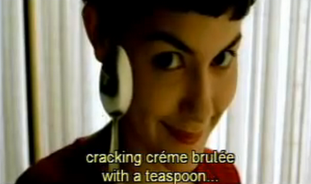
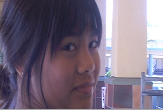
We did this by creating a mischievous character and a quirky guy to go with her.
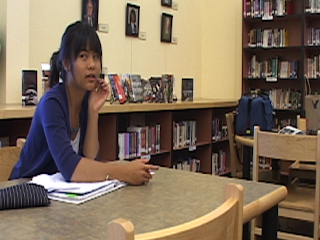
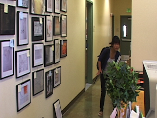
As co-writer, one challenge we had was trying to fit everything into our 2 to 5-minute time slot while still having an ending that wraps everything up. I don't think it ended up being a problem, however, because we were able to show the bully's reaction as well as what happened with Camilla and the boy. Another problem that I just discovered was that at the end of the banana scene, we catch the bully's reaction, but we never see what happens to Camilla. We may have done this because she was supposed to be out of sight so the bully can't see her, but even then we should've returned to her to see her reaction. Also, I noticed that we never show the boy's reactions until the last two scenes. That is quite a problem because the point of Camilla getting revenge is to make things right for the boy. Still, a reaction at the end is better than none, I suppose.

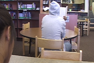
As cinematographer, I also took on the role of writing the 2-column script. We had some good ideas for the film, such as a rack focus for the scene with the PA announcement, but it didn't pan out because we didn't know how to do that. After all, it was my first time using the fancy camera. Now that I think of it, I should've asked how to do it, but I suppose I didn't because of our tight schedule. One shot that I liked, and always like when I see it elsewhere, is the over-the-shoulder shot of Camilla while the bully is introduced to the scene. I just like it's set up so that Camilla is off to the side working on her sketch, while the bully is in the middle with his hood on. It's here that we realize she's going to do something else to get revenge.
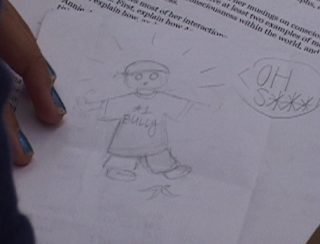
One cool thing that we added as a prop was a cartoon sketch of the bully slipping, just to give Camilla something to do before the bully/gum action. It ended up being rather funny when Camilla improvised by adding the bully's dialogue to the sketch. I'm glad I didn't stop recording that shot because it was a great idea.
We had to re-shoot the shot where Camilla winks because we noticed as we transferred the footage onto the computer that the shot was blurry. We also had a slight error in the banana scene where the bully is standing in the shot while Camilla puts the banana peel onto the ground, but we fixed that in time. Thank goodness for a patient actress. Overall, I wish I could have been more creative with my filming, but what's done is done. I'll just have to think about being more creative next time.

I probably had one of my easiest times editing with this project. Either my editing skills have improved, or I'm improving with my filming. One reason why it was easy was because Camilla was good at her gestures and positions for the sake of match-action-cuts. Also, for the ending, I thought it would be a cute thing to make a circle of the shot gradually get smaller. It just seemed like something that could add to the genre of romantic comedy.
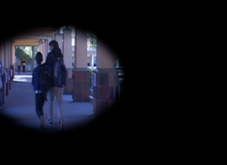
To add a more humiliating effect on the bully in the banana scene, I made the laughs echo a bit.
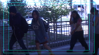
One problem was during the last scene because when we filmed the shot when Camilla and the boy skip away, we forgot to have Camilla stop for a second to have the winking shot. When the skipping shot resumes it looks like they were never stopped. Luckily she turned her head anyway, so we could squeeze the winking shot in. I hope it isn't too noticeable. Another problem with editing was with the banana scene. We had trouble making a realistic fall, so to try to make it seem less fake, I made one shot in slow motion.
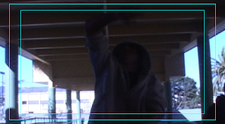
The next thing we know, he is on the ground. It doesn't look as polished as I would like, but I hope the viewers understand what's going on. In the same scene, we needed it to seem realistic that there is enough time for Camilla to place the banana peel on the ground without the bully being too close. To solve this, I made the bully's motions in slow motion as well. I thought it worked out well because the bully has his hood on, which quite frankly made him look like thug, and it works well with the hip-hop music I added in. Another thing I had trouble with was capturing the sounds of the mouse clicking and the clock ticking, so I added them in afterward using findsounds.com. Speaking of sounds, to create a more comedic scene, I added some cartoon-like sounds when the bully falls. I feel these sounds make the whole thing much more uplifting and cheerful. During the scene when Camilla speaks over the PA, we had to shoot it three times. One was at the angle below. The next was an extreme close-up. The last was just a voice over in the bathroom to make it sound like an echo. We used the last one outside as the bully and the boy listened.
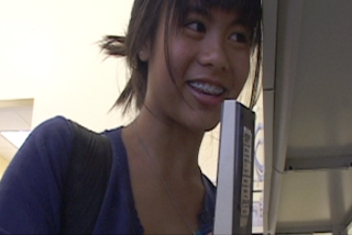
Overall, a couple of problems we had were that on our re-shooting day, we failed to warn the boy until that day, so he is wearing different pants. Also, one major problem we had was in casting. It was a day of panic because our original bully went home sick that day, and we really had to shoot. Luckily we had another tall and willing candidate to save us. We originally wanted a short boy like Camilla to play the bullied person, but that didn't pan out, so we settled for someone that could be very nerdy. It turned out great because it really added to the quirky and comedic effect we were going for in the end.

I think all three members were a big help. The only issue I picked up on was that Jenevieve had to miss a couple of shooting days. At that point I tried to work with Isabella in the role of director. However, I'm definitely not blaming Jenevieve because it's not as though she wasn't dependable or contributing. She only missed those days for medical reasons. It was merely unfortunate that they landed on our shooting days. I feel like Isabella was an important contributor, but I wish we could've given a bigger job to her. We assigned her to work on set design and sound, but, because of the simplicity of our sets and little dialogue, there wasn't much do do. However, she really became an important contributor on the days Jenevieve couldn't make it. Lastly, I think Jenevieve's directing skills are a work in progress, but I think stepping into those big shoes taught her a lot of skills that can help her in the future.

A CRITICAL EVALUATION

The extreme close-up of the first shot is interesting because it comes before an establishing shot. The two boys leaving when the bell rings are unrealistic because, for example, where are their backpacks? I like how the girl shows genuine emotion as she says bye back to the boy, but if she is feeling dejected, then why would she go the toward him with her head down instead of in the opposite direction? The music seems appropriate because it is sad.

The close-up of the girl's face is dark, so it is hard to see her expression. However, when I can make out her smile, the darkness adds to a mischievous effect. The bully and the boy are magically gone when Camilla turns and walks away. Also, the lens looks dirty, unless it was just the sun.

The next scene is good up until the bully falls. It is very unrealistic, but the sound effects do add to the humor of it. There are people standing in the shot when the bully sits up, but everyone already walked away. What happened to Camilla? We never saw what happened to her, and the boy never saw the humiliating effect on the bully.

The sketch is a nice touch. The acting of Camilla is good and realistic. The changes in music are a humorous addition. Why didn't Camilla just go to the bully's table once, so she could get out of there faster? This made the scene drag on a little. The gum part was funny-- good sound effect.

It's very easy to understand that she is sneaking into an office. Good point-of-view shot and then over-the-shoulder shot of her. The audio matches very well as she is in close-up, extreme close-up, and then we hear her outside. PA sound is fairly realistic. The bully's reaction is great, and it's good that we see a reaction from the bully. The music in the end is cute, which is good because Camilla and the boy are cute. The effect in the last, slow-motion shot is corny, but gives a satisfying end.


Saturday, September 25, 2010

Short Film Treatment Relating to Amelie! (title tbd)

Logline: After a bully picks on a girl’s only potential friend, she finds out his secret and makes sure he’ll never bully again.

A hand is sketching a random cartoon character on an otherwise blank piece of paper. A clock ticks. A girl is staring lazily at her work. Students in a classroom are bent over their papers, writing furiously. The girl glances up at the clock. It ticks three times and the bell rings.

Students put their papers on a table at the front of the classroom. The girl, alone, is last to leave. She puts her sketch on the top of the other papers. As she goes toward the door, she sees a boy waiting at the door. He tells her goodbye and says he’ll see her later. The girl smiles.

She girl walks down the hallway and stops at the end. She stares at the other students, laughing and chattering. She stares longingly, but instead changes directions to go a less-populated way to class.

As she turns a corner, she sees a bully picking on the boy that said bye to her. She stops to look and then continues toward them, asking the bully what he is doing. The bully says they're just messing around and tells her to clear out. She squints her eyes very tightly and turns on her heel to leave the scene.

Once again she is doodling in class, but it is a picture of herself kicking the boy. The teacher is rambling on indistinctly in the background. The clock ticks several times. She notices that the bully is sitting in front of her. The girl accidentally drops her pencil, so she goes down to get it. As she does this the bully gets up to sharpen his pencil. She sees his planner on the floor. It says at the bottom “Ballet Recital: 4:00”. She smiles evilly. She gets up again with her pencil. The bully returns to his seat, completely unaware that the girl was snooping. The bell rings.

The girl walks into the office to turn in a paper. She notices an empty administrator’s desk with the PA machine on it. An idea strikes, and she smiles toward the ceiling. She looks around her cautiously to see if anyone is around. The room is empty. She sneaks over to the PA machine on tip-toes, and sits down in the administrator’s chair. She presses the button on the PA and says, “[Bully’s Name] please come to the office immediately. Your mommy is here to pick you up. The time of your ballet recital has been changed to 1:00.” The bully is approaching the boy again, but stops when he hears this on the PA. The boy laughs at the bully, who’s face is frozen in terror. He runs away.

The girl walks out and finds the boy standing there, laughing. The girl laughs, too, and they walk off together.
THE END.

by Jen, Jen, and Isabella


Sunday, September 12, 2010

Amelie- 4 Stylistic Devices

1. When introducing Amelie (and the credits), we find that she is an unusual and imaginative girl. This is displayed with close-ups of things she does without having establishing shots.


The framing is tight because we don't expect Amelie to need to move around. Instead, we expect her to be in a following shot doing something equally childish. These shots are "close to the action" because if she did move, we want to move with her and be close to her. Otherwise, we are just on the outside looking in. We aren't supposed to care about what's around her because the focus on her makes anything an establishing shot would provide unnecessary. This reflects the film as a whole because we feel like we know her by the time she is grown up and going about her adventures. The viewer has a connection with her because of these several shots shown before the story really begins.

2. Another interesting thing is how Amelie "breaks the 4th wall". She looks at the camera to communicate with the audience.


The camera is at a neutral level so it seems like we're right there with her. There is tight framing because it's like (especially with the second picture) she's telling us a secret that only her viewer can know. People don't tell other people secrets from afar, but instead lean in so that we are close to them. I think this communication between her and her audience contributes to her peculiarity because one doesn't expect and actress who isn't even supposed to know they're watching them to suddenly talk or look at them. Although there is a voice-over narrator to tell the story, Amelie is also the one telling the story because of these little hints that she knows we're watching her. It reflects the film in a similar way to that of the first stylistic device, which is that the viewer can understand Amelie better by forming a connection with her.

3. Another thing that makes this film so unique is that when Amelie is watching the television, she imagines that the people on the screen are talking about her.


There is a black and white filter that makes it appear old. This make her seem like a long forgotten person who did much good in her life. She is trying to imagine a different life where she helped all of these people she met, such as the blind man and the old man with brittle bones. It is like an epiphany because she then tries to help those people because she wants to be remembered. This specific shot shows solitude because of the filter, the downward direction her eyes are looking, and all of the empty space in the shot. Amelie wants to change her lonely life so she doesn't have to die alone as well. this reflects the entire film because it gives her motivation to reach a different "destiny".

4. There is an odd special effect seen throughout the film of glowing orange at important moments. Sometimes there is an x-ray of something accompanied by it.


The dominant color in both shots is orange because it is such a bright color. I think it represents the warmth Amelie feels at doing good. Even though in the first shot she is being mischievous, she is doing it with good intent because the produce man needs to get what's coming to him for being so mean. It also just highlights the key so the viewer understands what she did with the keys. The second one more directly shows warmth because Amelie made it as though the blind man could see. He only needed to imagine everything she told him about his surroundings, and the orange glow effect make sit obvious that this was a miracle for him. The orange glow reflects the entire film because it supports the quirkiness of it.


Tuesday, March 9, 2010

"Going Beyond the Still Image"-"Wrong Place, Wrong Time"


Based on the character's expression and apparently being trapped in a box, we can tell that this character is frustrated with the current situation.


By the way the men surround the hostage, the height difference, the wrist being gripped, and the hostage's stance, we can tell that these men are dangerous and have power over the hostage.


This is a climactic moment because this is where we find out why the man is in a box at the beginning. This event leads up to everything else happening that support the situation. This is the reason the film is called "Wrong Place, Wrong Time".

This resolution leaves a feeling of sadness and gloom because of the blue tint . The photo makes us sad because we witness a moment in the man's life that he cherished, and he wants to see it one last time before he dies.

Reverie and the DSLR Revolution


By using the strong lights in the background, there is a mysterious silhouette around the woman so that we are curious to find out what happens when the man gets there. The extreme fall-off is interesting because it makes the anticipation in the man more pronounced.


This shot is interesting because it focuses on the smoke instead of the buildings. It represents a night in the city. Also, the lighting supports the focus on the smoke with the headlights shining in it.


This is especially cool because of a partly lit-up night with a spotlight on her. The vastness of the background and the simplicity of the foreground represent the loneliness as she is waiting. Also, the red dress draws our attention to her.

Wednesday, March 3, 2010

"Solitude" Review


I like this shot at a neutral eye level because it represents the loneliness lost in time that the teenagers are feeling. This is shown by the depth of the shot supported by the narrow hallway. A wide shot with loose framing and so much empty, still space also shows the loneliness. My eyes first go to the guy because he's the only thing there representing some sort of life. Using the jump cut represents all of the empty time the teenagers are experiencing. The lighting is also eerie because of the dark green glow it sets off, which symbolizes that this will be a scary movie. The lighting is fairly low key, but there is contrast with the white and dark green, once again showing an eerie scene. The shot starts with an empty foreground far from the "action", and ends that way, but there is one simple thing in the background and then the midground.


This shot is cool because it shows tons of depth and loneliness. My eyes start at the foreground and follow the road all the way until I can't see it anymore. There are a lot of parallel lines moving in the same direction toward a big dark nothing. The dominant color is a deep yellow with a contrasting gray sky. There isn't a lot to look at, but it represents what the characters are feeling when they realize everyone is gone. The foreground is road, the midground is road, and the background is eerie mountains. The framing is very loose so that if anything happened we could see it all.


First my eyes go to the girl's face because of the rule-of-thirds. Lighting is very low key, and similar to hte lighting in the first shot, and the shining duct tape makes my eyes go there next. There isn't much contrast because the girl's skin has that same eerie glow on it. We are right up in the action, and we see what she sees with the same reaction. We are at eye level with the characters because we are supposed to be seeing what's behind her the way she is seeing it. The density is moderate because we have to places to look at in the frame that tell a lot about the story. The girl is in the foreground, there is an empty green midground, and then a taped up guy in the background. The framing is tight because we're supposed to see the girl's expression. There is some depth because the background holds crucial information to the viewer while the foreground shows the reaction.

Wednesday, January 20, 2010

Avatar Behind the Scenes

James Cameron had challenges like developing the technology to create the film. He had to get the actors to act how they would act out the script, but wearing suits that can make the actors turn into a computer-generated character. Also, this film needed a lot of money to have all of the cameras surrounding the actors and making the computer-generated characters.

The process was creating a story behind Pandora. Next, they crated the moon. From that, they created the people and animals native to the moon. Then they added the magic of Pandora that makes it so different from Earth.

Performance capture changed the filmmaking process. Instead of using the characters voices and adding it to the digital characters, the actors were in suits that captured the movement and facial expressions of the actors. It's the actors moving instead of a digital character.

Making and marketing the film was 400 million U.S. dollars, 150 million of which is for Fox's marketing. News Corp faced the fear of not making enough money for how much was spent on the film. However, News Corp's operating profit for the quarter through September was 1.04 billion dollars. It expects to make 1.26 billion. It faces the fears of piracy, cheap rentals, high cost of production, and DVD sale declines. The massive budget of the film does affect the authenticity of its message because it shows that, with this amazing new technology, a large budget is needed if it wants to be realistic and make a profit.

I believe the plot is trite because of its strong relation to Pocahontas, as seen in the fail blog at http://img64.imageshack.us/img64/2938/mediahttp9gagcomphotdab.jpg . What I do see that is unique is the way the film is presented. We're not talking about some Native Americans in a forest. Pandora has its own unique natural world of luminescence and odd creatures that sets it apart from other films. Also, the Na'vi are blue with different facial features and proportions from humans that make the relationship between them and the humans even more distant, until Jake comes along. The idea of making new choices is not something new because isn't that just what John Smith did in "Pocahontas?" Avatar does bring forth a new form of technology through performance capture, as environment creativity never seen before by humans.