Sunday, December 18, 2011

"Taxi Driver"- 5 Most Valuable Minutes

11:10-14:42
*Note: All screenshots of extract are flipped from their original version as they came from a youtube source in which the entire film was flipped.

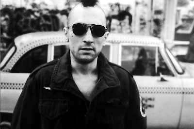
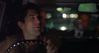
What happens in these couple scenes is that Travis (De Niro) is sitting with Betsy (Shepherd) in the cafe and Betsy tells Travis of the song he reminds her of. Then Travis goes ot buy the record of that song, he tells us of his next encounter through an interior monologue, and he tells Palantine what he should do if he was elected President.

I selected these five minutes because they not only tell us about Travis from his point of view, but they tell us about him from other people's points of view (i.e. Betsy and Palantine), as well as create a sort of two-faced character out of Bickle to influence an overall theme of the film. Betsy uses the lyrics of a song to describe Bickle: "He's a prophet and a pusher, partly truth and partly fiction. A walking contradiction." Although she uses all of these words, she says that the only applies the "contradiction" part, as she says in the dialogue.
These words create the idea that Bickle is two-faced because while he seems like a truly nice guy in this scene and the next scene when he talks about her in his journal, in the final scene of this excerpt he proclaims that the whole problem with New York should be "flushed down the toilet." This characterization is a recurring motif of the film because it shows how we never truly know Travis. He always continues to surprise us and sometimes what he does go against what we thought he believed. This highlights his mental instability throughout the film, which, instead of creating merely a psycho character creates a compelling, suspenseful film. This creates the theme throughout Scorsese's film that a person with a violent past who feels no purpose in their life resorts to such violence as means of gaining revenge.
This theme can especially be seen with the attempted assassination of Palantine, as well as indirectly with the murder of the pimp (, etc.) in the apartment. With the attempted assassination, Bickle was trying to get back at the government for all he had to go through as a Marine in the Vietnam War. Although we are never told of Bickle's experiences in the war, it is implied that the war had a strong effect on Bickle because of his mental instability demonstrated by his insomnia, confusing interests (Betsy and a triple x-rated movie?), and inability to take care of himself (pigsty of an apartment). Through Bickle's connection to Betsy and his encounter with Palantine in the cab, Bickle sees Palantine as an opportunity for him to disprove the slogan "We are the people". Bickle served his country by taking part in an endless bloodbath in a foreign country and all he got in return for it was societal isolation.
Pertaining to the bloody scene of the film, Bickle saw in Iris the victim he saw in himself, with the government acting as Sport and others in Iris' case. Therefore, because Bickle could not achieve his goal of revenge against Palantine and the entire political scene, he had to rely on helping someone he felt connected to (Iris) in order to feel a sense of closure so that maybe he could get over his past and create a life for himself (which relates to the final scene of the film with Betsy in the car, ending on a hopeful note).

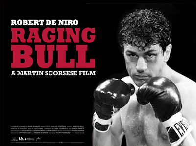
This extract relates to Scorsese's body of work with his recurring motifs of crime and violence, which often to go hand in hand. Many of his films, like "Raging Bull" and "Goodfellas", are perfect examples of these motifs. "Raging Bull" is about a boxer (De Niro) who becomes alienated from his family and "Goodfellas" is about the rise and downfall of a crime family (Mafia...) (Source: Wikipedia).
These and "Taxi Driver" do not attempt to create a candy-coated society in which the protagonist is a hero. Quite on the contrary, the protagonist is a bad guy in many cases but has certain qualities that still make them a likeable character who has some moral motive (anti-hero).

The extract relates to the narrative and plot structure of the rest of the film through how we get a straight answer from Bickle about his beliefs and this foreshadows the events of the climax and rising action in which he attempts to carry out his goal of "flushing" the problem down the toilet by getting rid of people like Sport, as well as attempting to get rid of Palantine, who he hardly sees as a solution to the problem. In some sense, when Bickle refers to New York as full of "filth and scum" he is referring not only to the city itself but the people living in it, even Palantine.

The director's intent of the film is to portray New York City as it truly was in 1976 and show the negative effects of war on veterans. The city was quite honestly a dump, and the significance of Scorsese's honest portrayal of it makes it a part of the city's history that can never be forgotten. Martin Scorsese was born and raised in New York, so naturally he would have a personal connection to the city that could influence his desire to create an accurate portrayal of the city. In addition to the hustle and bustle of what was then a filthy city, it seems natural that a poor guy like Bickle with his trauma would get caught up in the smoke and steam.


Not only does Bickle seem lost but everyone seems lost. The difference is that Bickle does something about it, which highlights his identification as the anti-hero.

The way this film relates to film history is through the popularity of the anti-hero that seems to rise up after wars (e.g. WWII or, in this case, the Vietnam War). This is seen in the extract through how Betsy characterizes Bickle as not being a perfect person but a "contradiction," which foreshadows how unpredictable Bickle is, especially when it comes to shooting eveyone in the apartment building and attempting to shoot Palantine. Also, in the taxi ride he says that the whole problem with New York should be flushed down the toilet, thus making him seem as though he is a person with questionable motives.
The idea of an anti-hero helps fulfill the film's genre as a western with film noir elements (according to Tom Dirks). The protagonist in a western is oftentimes a rebel in society, which describes Bickle with his violent outbreaks and "alienation" in society (Tom Dirks). The film noir aspects show with how much of the film is during the nighttime in a busy, depressed city. There are aspects of suspense involved, as well.

Monday, December 12, 2011

"The Rise of the American Anti-Hero"

The Question: What historical factors influenced the rise of the American Anti-Hero in cinema and how does this hero contradict the Classic Hollywood Ideology.

The land of the brave, eh? The anti-hero, in America in particular, has become more and more popular as the classic, if not cliche, concept of hero versus villain. These anti-heroes are not considered to have the qualities of any old hero, evidentally because they are the "anti-". Therefore, what makes them the anti-hero is because, in my opinion, they are working toward some personal goal in which they reflect some qualities of a hero, such as bravery. In the film we just watched in class, "Taxi Driver," Travis Bickle, played by none other than Robert De Niro, shows no signs of heroism, which is implied strongly by the title.
However, this is a war veteran we are talking about and the film shows traces of the elements of a Western, so while Travis is quite frankly pathetic, murderous in thoughts and later actions, and in no way someone a little kid dreams of going up to be, he does reach his personal goal of helping the prostitute get her life back. We are awe-inspired by Travis, but disgusted at the same time when we see the idea of his greater good, attempting to kill of Palantine. This is a common theme throughout anti-heroes in American films: the protagonist offers a set of two-faced poignancy in which he possesses the qualities of a true hero and then brings in the "anti-" by doing something stupid, disgusting, or horrific.

Henneberry says that "The anti-hero became a darker, edgier character, who was just as confused as the average American." A war veteran forced to go back to normal life without any real purpose is enough cause to try to find a purpose. Such characters could relate to the audience because, much like Steve McQueen was described in the article, they were realistic without being fluffed up in order to be called a hero. This contributed greatly to the rise while leaving room behind to discover an actual moral even though the anti-hero may have very few.

Films like "Damsel in Distress" are ideal for the Classic Hollywood Ideology because they go with the same old story of the hero rescuing the damsel while meeting obstacles on the way. This contradicts what a anti-hero stands for in many cases. While this contrasts with realism in terms of cinematography, as films are becoming more and more formalist, it connects to realism in terms of reality.
What could cause such an awakening? WWII caused a lot of damage for the US, especially compared to WWI, because US morale was lowered by such events as Pearl Harbor. This event, in line with the events of war following, changed the US forever. This was one factor in the rise of the anti-hero.

Another reason is that they wanted themselves to be reflected in film through the use of characters that went against the norm much like Americans rebelled against the status quo. The generation that came out of WWI America was one of rebellion (i.e. teenage rebellion) during the 1960s, which was when anti-hero films became very popular. This generation didn't want to have to live in such a society that caused the US to be involved in something as horrific as WWII.

The third factor also related to being realistic; having human heroes to represent humans "who were true representations of life, who were faulty and vulnerable, like America's real life heroes." It is a salute to our soldiers in the war. What is interesting is how this anti-hero trend has lived on to the present, perhaps because of other wars giving a new cause for nationalism, such as in Vietnam and Iraq.
The fourth and final reason is that audiences wanted an accurate portrayal of the American spirit, its culture, without any polishing to go along. This goes along with rebellion because it tells telling the world "Hey. We're American and proud! What are you gonna do about it?" Establishing such as sense of nationalism through film was key in maintaining morale even after the war with its devastating effects on the whole world.
The darker side of the idea of an anti-hero mascot for the US is that it is an accurate represenation of America as a whole. The anti-hero is not a perfect hero but a regular person who can be very violent or merely unpleasant but for some glowing moments of acting heroically, although sometimes not inentionally, such as when De Niro tried to kill himself after murdering many people in'Taxi Driver".
Nonetheless, the negative side of these characters acts as a reflection of American atrocities, such as with the atomic bombing of Hiroshima and Nagasaki. That is something the US cannot deny and it was such a large event in American history, so it was bound to have its effect on the anti-hero.
Overall, to answer the question, the rise of the American anti-hero was influenced by WWII and events following so that it turned the Classic Hollywood Ideology of a perfect hero into the anti-hero, which was more emotionally accessible to Americans and a more realistic view of America for Americans in terms of self-identification, as well as for the world.

Sunday, December 11, 2011

Film Portfolio!!- Wig'd Out

A. Rationale:
We made a comedy that seemed like it would be romantic but essentially was a bit gross. Our plan was to gradually expose the audience to the strange habits of this guy who seems to be interested in a girl, only it is actually just her hair he likes. We wanted to do this film because it was simple, yet compelling and showed our ability to make an audience laugh. It seemed like a good idea because with comedies actors are easy to work with and we knew it would be funny. The audience is anyone looking for lighthearted entertainment.

B. Commentary:

My areas of responsibility were cinematographer and co-editor.
As the cinematographer, I foremost found it difficult to work on a café front of a relatively populated area of town. We often had to stop just before getting a shot because someone was about to walk by. Another part of this challenge was that we could see inside the café through the windows, so people came and went while we were shooting the same scene. This caused some error in continuity as people suddenly appeared and disappeared between cuts in the final edit. However, to solve these problems we just allowed as much time in our schedules as possible with the fast-approaching deadline to shoot and we tried to be polite to the random passerby, but there was no true resolution, especially with the continuity error. Another challenge I faced was with lighting. The film is supposed to be set during midmorning, but one of our shoots had to be shot after school because of the deadline. However, with winter approaching, it got dark much sooner than our completion of shooting, so we had to shoot without sunlight, which was out source of light for the rest of the shots. We were just glad that there was light in the café to offer some assistance. We solved this issue in editing with various filters, as I will later discuss. As cinematographer, though, I tried to fix the problem as best as possible by increasing the exposure to its greatest extent.

As the co-editor, one of my challenges was with how to present the first scene with Jen coming to the café and going about her routine. It involved costume changes, so to save time rather than have her change back and forth we just shot the complete scene twice in both outfits. In the edit, I thought about overlapping them, but the camera was moved in between outfits to get other shots, so I had to settle with cutting back and forth between the two outfits with a lot of cross dissolves. Therefore, where Jen was in the frame by the end of the shot with one outfit she picked up with in similar framing in the shot with the second outfit. Another challenge I had as co-editor, as aforementioned, was with the lighting. In this instance, I had to use the 3-way color corrector filter on several shots. I tried applying a cloning tool to match the color and lighting of one of the well-lit frames to the poorly lit frames, but it made other qualities of the frames look poor. With this in mind, I resigned to increasing the whites and saturation levels dramatically and slightly decreased the blacks. Despite the problems in lighting, it was difficult to tell that there was any problem at all after applying the video filter. Another issue we had was with a couple of shots with the male lead’s dialogue. Although the camera had not been moved or shut off, the color temperature changed drastically between these couple shots and the shots preceding it, although I, as cinematographer, did not notice at the time. These two shots had a very high color temperature, while the others were fairly low. As, co-editor, I resolved this by using color correction. I merely used the color wheel to make the color temperature appear more consistent. One last problem in editing was with our audio for dialogue. Some of it came out very low, so I had to use the gain audio filter to raise it. However, some audio had a lot of static gained in the process. This was a problem we could not solve, but the choice was that we either had audio that could not be heard or we had audio accompanied by static. The dialogue was crucial, so we decided to keep the filtered audio.

As a whole, our group had problems with actors and schedules. Our original film concept was completely different and we had shot about half of it when our lead actress told us that due to her commitments to the school musical and her parents’ inflexibility she could no longer film. Therefore, we had to scrap everything we had already done and come up with a less complex film that could be shot in a couple of days. We managed to shoot, but it was rushed, so what we accomplished during our shoots with our more flexible actors was not as good as we had hoped. Still, we were very pleased that the final product was a general success. Luckily, we had no issues with group members as they were all very dependable and it helped that 2 out of the 4 of us had cars.

Critical Evaluation:

This film is clearly of the romantic genre, as there are many periods of silliness in the actors’ expressions and actions. However, the only thing that establishes this in the first minute or so is the choice of music. It is French accordion music that creates a light mood. Otherwise, the genre is not clearly established by what we see, as all new see is the girl going about her routine and a creepy person watching her. Still, the surprise created by the motif of hair and the reaction of the girl makes it a good attempt at being funny.

The narrative itself is interesting as it seems to unfold with a guy who has taken an interest in a girl, but it turns into a story in which there is a happy ending for no one, only grossness. I feel like the between the two people could be further developed, as well as the climax, but the story does feel resolved with the appearance of the other girl who walks by, which also adds to the comedy aspect. To improve this as well as the identification as a comedy, there could be a scene in which the two seem to be getting along fine and then he later finds out about his obsession with hair, thus making the intensity of disgust between the two much more potent. To avoid such problems in the future, special attention should be paid to character development in increasing the effect of the climax on the audience.

The acting is believable, for the most part, although at times it seems as though the girl is fighting back giggles. Still, the cheesy nature of the climax was evidently deliberate and full of laughs, so this makes up for any faults in acting. Once again, though, the relationship between the characters could be better developed.

As far as editing goes, there are some stylistic elements that enhance the film. For example, the choice of classic horror music for the moment in which the wig is revealed adds to the comedic genre. However, this could have been further utilized with the use of an echo audio effect in witnessing the girl’s reaction. The use of cross dissolves suggests the passing of time in the first scene fairly well. On the topic of time, though, I feel the shot with the guy watching the girl in a time lapse is much too lengthy, for while it establishes the nature of the guy’s obsession with the girl this could have been established if the shot was shorter, as well. Still, they made well use of the slow motion in shots, such as when they show the girl’s reaction and the new girl flipping her hair. One interesting technique used was a video filter at the end in which there is a glow around the other girl in which the guy has taken a new interest. This heightens our perception of the girl so that we see her as the guy sees her, thus establishing the perspective of someone we don’t necessarily want to have the perspective of due to his disturbing personality. Overall, the film’s moderately formalist nature is evident as serves to create an altered sense of time and visual perception with its manipulation of time and visual effects, although they are not overdone.

The score fit the genre well in its lightheartedness, but it could be interpreted as misleading for its implications of romance (it is French music, after all). I like how the same music from the opening scene is repeated at the end because it gives not only a sense of resolution but a sense of the male lead’s character with the new hair interest of his. The use of the classic horror music in the climax is effective as it is the most intense part of the score, thus highlighting the events it accompanies. There are no discern able sound effects, but this does not seem to disadvantage the film, for this type of comedy seems best suited as being simple.

The cinematography is mostly static, but, once again, it adds to the simplicity of the film as a part of the comedic genre so that it does not distract from elements of this genre such as the characterization of the male lead. However, there are some graphic vectors with the use of lines down moving down the street with the male lead in the foreground, the female lead in the mid/background, and the rest of the avenue in the background. This highlights the guy’s attention to her, as if he is being drawn to her (or her hair, at least). There are some close-ups used only to show character’s reactions or simply emotions, such as when the girl sees the wig or the guy’s eyes follow her when she leaves in the first scene.

The production design is fairly good as there are no continuity errors in costume design for either character, thus showing the passing of time without causing confusion. One issue in mis en scene is that there is no control over the extras as they are random passerby and café patrons. Therefore, in the same scene, one person may be in the background in the café in one shot, but when it cuts back they may be gone or someone else may have taken their place. This could have been fixed with the use of shallow focus by the cinematographer to emphasize what is happening between the characters, as well as avoid noticing such continuity errors. The choice of location for the film was advantageous as it seemed like a place people could go to on a regular basis and it had outside seating that isolated the characters with each other.

Overall, I believe this short film is a success because it achieves its goal of being funny with a disturbing twist. All of the errors are either very minor or merely missed opportunities, so they are not distracting in receiving the overall point of the film: some people are weird, so just stay away.
C. Supporting Material: https://sites.google.com/site/causeitsib/

P.S. It's about time I finished this...

Wednesday, December 7, 2011

"Intensified Continuity"

The Question: According to David Bordwell, explain how and why continuity has intensified in Hollywood Cinema. Also, consider whether anything has been lost with this change.


The four areas in which continuity has intensified in Hollywood Cinema are shot length, lens choice, close framing, and a free-ranging camera.

What I find fascinating is the gradually decreasing average shot length. As the shots became shorter and cuts became more frequent, films became more "intense". This can be considered an evolution as far as technological advances are concerned, but has film lost the flavor it once had with its once long takes? There is a socioeconomic influence on shot lengths' impact on how action-driven films are today. An appropriate analogy would be a car in the 1920s versus a car today. In my opinion, much like how all of the technological advances made in the world as a whole embodied inventions making communication and transportation much more quick and efficient, the film world grasped on to such changes to try to keep up with its rapidly moving audiences. Another factor, as Bordwell states, is that "when an independent goes mainstream, the cutting is likely to accelerate." This basically implies that everyone in the audiecne wants the same thing--a fast pace. Out of this socioeconomic factor comes the idea that in order to be a successful filmmaker independents must comply to the invisible boundaries set by mainstream filmmakers. Ultimately, technology is a driving force in decreasing average shot lengths because we as an audience (unless you're a sucker for old films) are accustomed to a more fast-paced life.

Technology also has its influences in other areas, as Bordwell discusses. Lens choices have been leaning toward long lenses, perhaps due to its use in close-ups, medium shots, over-the-shoulder shots, and even establishing shots, according to Bordwell. However, they have been mixed with other lenses, such as wide-angle lenses (i.e. Spielberg). I believe the long lens allows for more stylistic cinematography that makes a film more visually apealing, such as with rack focuses, which became more popular in the 1960s.

Another important aspect of intensified continuity in cinema is how all up in your face the actors are getting. In more sophisticated terms, the framing of shots is oftentimes very tight, especially during dialogue scenes. This puts a strain on the actors because all they have to try to get the director's point across is their face. Dialogue can be a very powerful source of communication in which facial expressions offer characerization. As Bordwell states, "Most important, the pressure toward closer views has narrowed the expressive resources available to performers...Mouths, brows, and eyes become the principle sources of information and emotion, and actors must scale their performances across varying degrees of intimate framing." But what about the rest of the actor? Body language in such dramatic scenes is limited to the face, which demands a lot of the actors. In some sense, this may be why some acting seems so unrealistic or cheesy. It is so much harder to act witih such limitations. With the use of the long lens there is therefore a technological influence on the commonly used close-up.

Long and wide shots are rarely static these days, as aforementioned. The demands of the general public are that the bigger the better because these are considered to be epic. One might say to a static long shot today that it can be compared in its fascination to "Arrival of a Train," but a tracking aerial view of the a horse running across the Fields of Pelennor in "The Lord of the Rings" would be considered eye-popping because it is as though the viewer is flying (I know I feel this way, at least). Bordwell states, "Today, everyone presumes that a long take, even a long shot, is unlikely to be a static one." Therefore, because life is much less "static" than it once was, there is more that the audience expects. Movement is naturally more compelling, which is why many youth of the modern day find many classic films boring in nature. Quite honestly, I find the realist film "Arrival of a Train" very boring (no offense to the filmmaker)because I am so used to something like "The ord of the Rings" or "Inception" in which there is much more to be seen and heard. However, someone at that time might consider "Arrival of a Train" a thrill because film was so new. Nonetheless, the use of movement in film has greatly increased as the cameras became lighter and devices were made to allow movement.

As Bordwell discusses, there is a sort of cause-and-effect in intensified continuity. The tighter framing leads to faster cutting (there is less information in the frame to process), long lenses allow for faster cutting (e.g. rack focus tells you what you are supposed to see, although it is visually appealing), and the free-ranging camera cannot help but follow the commotion provided by technology, producing in some sense even a domino effect. Ultimately, the films have increased in intensified continuity to such an extent that they are getting old. At least in my opinion, it is very rare to find a mainstream film that follow such stylistic elements without being repetitive like many other films out there today that stick close to the action. As far as answering the question goes, continuity has intensified in Hollywood Cinema through the cause-and-effect relationship posed by such elements as rapid editing, long lenses, tighter framing, and more camera movement because of the circular influence of technology in which technology allows for more in film and causes audiences to demand more, in turn.

Tuesday, December 6, 2011

Soviet Montage (Classicism), Formalism, and Andre Bazin (Realism)

3. Soviet Montage and Formalism

a. What was Pudovkin's concept of constructive editing and how did it manifest itself on film?

According to Pudovkin, shots are meant to express something new to the audience as well as create meaning when shots are put together. Close-ups can unite meaning while long shots are much too realistic. The way montages are put together portray the underlying idea. In Pudovkin’s film called Mother, there is a juxtaposition of images cutting between the mother in a crowd and the son traveling far and wide to reach her. There are cuts between the close-ups of the son’s expressions, the mother’s expressions, and ice being broken up, thus attempting to produce the underlying idea that mother and son must meet obstacles before they can finally be reunited.

b. What was the Kuleshov effect and give me an example of how is it used in today's films?

The Kuleshov Effect cut from shot of a person’s singular expression to something that could explain the expression, then cuts back to the person with the same expression, another object explaining the expression, and then over again. The basic idea is that an actor’s expression juxtaposed with an object of interest creates meaning in that expression and merely changing the object of interest can easily change the entire meaning of the expression. An example would be man, bowl o’ soup, man, coffin, and man, enormous electricity bill. It seems as though the man’s expression changes because of what is in front of him, but really the expression is the same. One film that uses this is Stanley Kubrick’s “The Shining,” Not only does the father maintain a continuously disturbing expression throughout the majority of the film, but the son in the hallway maintains the same expression of fear when the two girls are in the hallway and when they disappeared (were they ever there?).

c. What was Eisensteinian Montage and how does it work in the "Odessa Steps" sequence?

Eisenstein’s Montage was a montage in which its meaning went beyond simply the film. In the “Odessa Steps” sequence, by cutting from wide shots of the fleeing people to close ups and medium shots of specific people, it creates a much more potent effect of fear and sympathy in the audience. This effect would not work if the montage consisted merely of a series of different angles of wide shots in which the emotions of the people were not captured by tighter shots.

4. Andre Bazin and Realism

a. What were Andre Bazin's frustrations with Classical and Formalistic film making?

Bazin as a critic clearly favored film as a representation of real, everyday life. Therefore, such formalist films of filmmakers like Hans Richter, who used abstract cutting. He felt as though filmmakers did not have the right to manipulate reality in such a way because it was distracting and distorted, that they were merely observers. Bazin feels as though less editing and variety allows the audience to pick out what they feel is important and form an opinion about it rather than have it done for them by the filmmaker.

b. What do Realist filmmakers strive for in their work?

Realists strive for as little manipulation as possible to maintain an atmosphere as close to reality as possible. They, along with Bazin, believe the best film lies in what is true, not in what the filmmaker interprets as true. They aim to leave as much up to the audience as possible by allowing every object in the frame to be an object of thought, whereas classicists and formalists take matters into their own hands to reflect their personal views.

c. What techniques to realists use in their filmmaking?

This is achieved through long shots, lengthy takes, deep focus (so one can take in everything the frame has to offer), and tracking, panning, and tilting (to get a well-rounded view). In more early forms of cinema, this would be achieved with a single long and stationary take of some event that is seen through to the end. Later on, there may be shot variety, but it may only be to get a different angle of the same thing so as to get a more well-rounded view of whatever reality the film is attempting to portray.

"Arival of a Train" and "Damsel in Distress" (this stuff is old school...)

"Arrival of a Train" was a film made in 1895 by the Lumiere brothers, so evidently at this point the idea of film was very new. It is composed of one stationary shot (did you really expect them to be able to move that big camera?) of a train arriving with passengers and passengers awaiting the train so they can depart. Just because it is one stationary shot does not mean it isn't a good one. This single shot expresses so much by showing two points of view, those who wait and what they are waiting for, that ultimately blend to form a pleasant chaos that portrays everyday life of boarding and leaving a train. Even the shot composition in this single shot is outstanding because of the strong use of graphic vectors: the train creates a line moving from background to midground to foreground (based on where it arrives from) to represent the great journeys each of the people we see is taking. It turns these simple figures into meaningful characters even without the use of closeups. Overall, this film would definitely be considered realism because it is a continuous recording of time, the shot lasts as long as the event (the "arrival of a train") and there is a very basic story being told. The simplicity of the film (due to its label as "early cinema"), however, does not allow it to be identified as an example of classicism or formalism.

The other film I looked at, D.W. Griffith's "Damsel in Distress," although still early on the film spectrum, was much more advanced in terms of shot composition, editing, and narrative. It includes a villain, a damsel in distress, two heroes, and a seemingly inevitable obstacle. This villain ties the damsel to the train tracks when a train is speedily on its way. The damsel is stuck there, so why doens't she be resourceful? She takes out a whistle and calls for her dog. Help is on the way! Or, is it? The dog gets there alright, but the lack of opposable thumbs and other necessary tools keeps him from freeing the damsel, so he runs and gets the help from another man (a "Good Samaritan", says the person on youtube who posted the film), who comes and tries to get the girl out of the way while the dog makes the conductor stop the train. The damsel is saved, the villain is caught, and the man-hero and damsel make out as the train moves along on its journey. While I would not consider this film formalist (there is no manipulation of time or space, only a hightened sense of it through cross-cutting), it is definitely realist for its common use of long shots (often with the accompaniment of a black, circular matte to highlight what is important) and classicist for its dramatic tendencies (such as character development and how it works into the plot).

Let's compare: this story of heroic triumph versus the arrival of a train. The train is important to the narritive structure of both, no doubt, but one is from a more neutral standpoint and the other is from a standpoint of frantic anxiety. Additionally, the shot variety of "Damsel in Distress" allows for the development of the narritive to create characters with unique personalities, rather than a uniform personality within potential train passengers. The differences in the edit are that for the latter film there actually is an edit. It required all of that tedious trimming that the first film did not. This definitely allowed for characterization, as well as concepts like parallel cutting that are still used today. While the damsel is being tied to the tracks, it cuts to the train speeding along toward her, thus identifying a pressing conflict during the first five seconds. As the story develops, it even cuts quickly between the train, the damsel, and the man on the bike, thus allowing for an intensity that the first film does not have. This parallel cutting is a key feature that can be found in films that use time as an important factor (from "Damsel in Distress" to "Run Lola Run"), even though it may not be for the entire film. These can make up the rising action, especially in short films, such as "Lovesick" (the one with the guy chasing after the girl he doesn't even know yet). There is the use of a black, circular matte that highlights the charactersn because this film lack the use of close ups, or at least close ups as we know them. Some of the most memorable shots include one of the shots of the train that has a strong graphic vector that makes shows how the train is moving forward towards its goal, no matter what (or who, in this case) is in its way. The same goes for the first film, only there is nothing in its way to establish a narrative quite as complex as the latter film. This highlights an important use of angles that makes the film much more compelling. However, in the latter film there is movement, such as tracking shots of the train, the dog, and the man on the bike. These show the different journeys of important aspects of the film that are all destined to approach the central figure, the damsel. In other words, they come from points A, B, and C, but they all move toward point D.

Monday, November 14, 2011

Thursday, November 10, 2011

Trailer Review- The Lord of the Rings: The Return of the King


I decided to review the trailer for The Lord of the Rings: The Return of the King (my favorite movie, by the way) in terms of how it uses narrative, cinematography, editing, and sound (effects and score).

Narrative

Based on the characters, locations, and all of the fighting, this film falls under several genres: action, adventure, epic, and fantasy. The trailer also embodies the universal concept of good versus evil by showing the enemies and then contrasting them with the good side.
The basic idea of the film can be understood by those who have not seen the previous two films. Much of the trailer is narrated by various characters in the film by picking out lines used in the film, and they are often used as transitions in the progression of the trailer's plot, such as when Gandalf narrates, "We've come to it at last" and we then see the vast army of the enemy awaiting battle. The trailer identifies the issue (the enemy) and then the trailer brings the audience to the most pressing situation: Frodo and the Ring. They suggest the isolation between characters through dialogue between Aragorn and Gandalf in which they question whether or not Frodo is even alive.
Through a bit of meaningful dialogue, it is is established that the enemy has arrived. The pace of events shown picks up to highlight the most significant part of the film, which is the big battle to end the struggle.
The trailer also serves to give glimpses of each significant character and how they work into the film without giving too much information.

Cinematography

Many of the shots in the trailer are aerial and/or eagle eye views, which supports the genre of adventure and epic by showing off the location and vastness that implies the magnitude of this final film.

The shots of characters are generally medium close-ups or close-ups for the more emotional parts, thus signifying their importance in the film to the audience. This is meant to get at the audience's emotions so that they are more likely to want to see the film.

The lighting in the shots are often dark, providing an overall tone of evil or hopelessness, while other shots are more warm-colored to give a sense of hope or even urgency (see screen shot).
Editing

The pace of the film starts off fairly slowly. When dialogue brings the film back to the pressing issue of Frodo and the Ring toward the end of the trailer, the pace of evens reaches its maximum with glimpses becoming shorter and shorter to provoke maximum interest. The shots fade in and out to black to increase tension and so that the audience waits to see more.

It is also cut so that it is chronological according to the plot, although some shots are out of order toward the end (when the pace is quickened) and are there to merely highlight action.

Sound (Score and Effects)

The score in the film is appropriate to the genre--an epic orchestral compilation that emphasizes how "Wow!" the film will be.

Sometimes drum beats fall as shots are shown. There are growly noises when we catch glimpses of the prime enemy and when we are shown fast, intense shots.

Saturday, October 1, 2011

"Run Lola Run" Editing Presentation--Critique


Our presentation was an overall success in terms of getting all of our points across and keeping to our topic of editing. Our interpretation of the film through editing seemed fairly spot on because we discussed how odd this film was compared to others (through the discussion of formalism), as well as the importance of time in both its manipulation within a shot or shots and the pacing (cutting). Some prime examples that display our interpretation are the slow motion and how it's used at pivotal points in the plot, the use of split screen to show parallel action, and the use of fast cutting to highlight the fast pace and tension in the film. I think our use of film language was fairly good, going from simple terms such as "slow motion" to more advanced terms like "formalism" However, I think it could have been further developed, such as how I did not use the term "associational cut" in my analysis of the scene of Lola and Manni on the phone when Manni is discussing how the homeless man could be on a plane anywhere by now.

I believe a strength of my presentation were my analysis in my attempt to go under the surface of examples. I also think I had good examples and screens shots, such as the shot of Lola getting shot and the bag flying up in the air. A final strength was my use of quotes. I tried to find Tykwer's quotes, from his take on "Run Loloa Run" that we went over in class, that were the most relevent to whatever point I was trying to make.

One challenge or weakness I had was my limited use of film terminology. As mentioned previously, I could have used the term "associational cut" for the homeless man/vacation example. Also, there was at least one thing I failed to see in my examples that related to editing. The one mentioned in class that I fialed ot notice was the graphic match of Lola on the ground after being shot transitioning to the intimate scene between Lola and Manni. Also, I find it hard to tell when presenting and when I did not get feedback on it, but I may not have looked at the audience enough and may have looked too much at my notes and the screen.

HoodBlinked

A girl arrives at her doorstep with a guy. They stand shyly and hesitantly next to each other; they both twiddle their fingers, unsure of what to do next. "Well, I'll text you later," the guy says with a smile. "Yeah, okay. See ya," the girl responds, returning the smile, not the least bit disappointed. The girl slowly starts to reach for the doorknob, but the boy quickly takes her outstretched hand and pulls her toward him into a quick hug.

Taken off guard, the girl bites her lip with a smile. The guy lets go and they are seen smiling even bigger than before. "Okay, now I'll see you," she turns and opens the door, stepping inside, while inside her head she squeals. The door shuts behinds.

An alarm clock goes off. Its bright numbers flashing repeatedly. We see a neat room and the girl rises with a big smile and gets to her routine: jump cuts of teeth being brushed, her legs trying to make their way into her pant legs, her hand pulling up the zipper of her jacket, hair being put into a ponytail, shoes being put on, and finally a waist shot at the end of the routine.

A voice calls out from downstairs, "Morning hun."

"Morning, Ma," she calls back, about to walk out her door. The girl passes her clock and checks the time: 10:12 AM.

She blinks: the clock now reads 10:12 PM.

It's now nighttime and the girl finds herself in her pajamas again with her hair down. That's not supposed to happen..She slowly turns toward the window and sees the night sky. She looks down perplexedly at her pajamas, her hand grabbing a fistful of her shirt. And wasn't I wearing actual…Um...clothes?

Her mom yells from another room in the house, "Night, hun."

Um, Night? she thinks as she looks toward the door. The girl checks her phone for any texts. She sees some from earlier that day, only she doesn't remember reading or responding to them. There was one text confirming that she has another date with the guy. Since when do we have another date? The girl checks her calendar and we see the the girl mark the calendar for the next date, 3 days later. Hmmm…

Glancing at the clock, she yawns with her eyes closed for a few seconds: 10:14 PM. Now, her hair is in a braid. Yeah that's weird. The girl touches her hair, but then shrugs off the strange happenstance. Her phone vibrates and she checks it. She quickly texts back as she sighs. When she puts the phone back to its home screen, the date is changed to 4 days later. The girl's eyes widen OH MY GOSH. and she looks at her calendar. The day for her date has been crossed off. The phone vibrates and she checks it. There is a text from the guy she went on a date with: "Are you okay? Every time you respond to my texts, it doesn't seem like you're all there." She purses her lips in thought Well maybe that's because I HAVEN'T been responding to your texts, puts the phone at her bedside, and then gets into bed and looks at her clock again and turns the alarm on: 10:14 PM. She puts her head on the pillow and lies there. The girl sighs, then the crickets gradually become the sound of chirping birds and sun falls on the girl's face [this is not one of the phenomena of time, just a transition].

The girl's alarm clock goes off at 9:00 AM and she turns it off without looking. She gets up and goes through the morning routine again, exactly as in the first scene. She goes back and checks the clock: 10:12 AM. Then, looking up in thought and suspicion, Maybe if… the girl looks at the clock and closes her eyes, even squinting them shut. We hear sounds of time moving by quickly, and when the girl opens her eyes, it is 10:12 AM.

The girl nods her head in triumph at solving her little problem.

She sees a missed call on her phone from the guy. She calls the guy, and a female voice picks up on the other end: "Hello?"

The girl quizzically asks for the guy and the voice on the other side pauses and hesitates. Static can be heard and then the guy's voice is heard, "What do you want?"

"When are we going on our date?"

"What are you talking about? We haven't talked in three months."

The girl freezes. Three months. We spin around her as we cut to a calendar passing through the months until it becomes transparent with the girl. The room starts to become a wavy blur, causing her to drop her phone. The loud crack on the ground can be heard as well as the guy on the other end saying "Hello? Are you there?" She ignores it, runs to the clock and pulls out the plug. The clock crashes to the floor and in that same instant, there's a whoosh as she wakes up, eyes wide. The swooshing sound merges with the sound of the alarm clock and her eyes move toward something off-screen. The camera follows her eye line and lands on the clock, unbroken, on the stand blaring the time of 9:00 AM.

The girl picks up the phone and calls Pleeeaaase pick up! "Hello?"

The girl closes her eye in joy and smiles, relieved. Yes!

Saturday, September 10, 2011

Revised Dress Code Segment- Critique

Jenevieve and I came up with the idea to do a revised dress code segment by noticing all of the strong feelings toward the subject since Mrs. Shanks announced it at the end of last semester. The only research we had to do was familiarize ourselves with the dress code, but this wasn't much of a task because we'd heard it so many times already. We wanted a range of people for interviews, so we chose a sophomore (Alec), a senior (Camilla), a teacher (Ms. Ferro), and, of course, Mrs. Shanks (mainly to justify the decision and try to help students understand). We made sure our questions were focused and relevant, but still allowed for the interviewees to give an opinion. It was difficult to come up with good ideas with b-roll because we obviously had to show students and what they were wearing, but we didn't want to point rule-breakers either. Basically we envisioned a couple shots of students at lunchtime and the photoshopped stills of what not to wear.
For Ms. Ferro, we used her classroom, but we set her up at a diagonal so the shot wasn't quite so boring.
For Mrs. Shanks, the window made it a little hard to set up the shot at a nice diagonal, so we put her up against her bulletin board, which actually had the yellow dress code paper off to the side.
For Alec and Camilla, we set up outside (Camilla by the office and Alec by the cafeteria), but it was during 1˚, so there weren't any distracting noises. None of our shots were creative (we just used stills to add to the interviews). I think we set up Mrs. Shanks well, but Ms. Ferro, despite being on the wrong side based on where she was looking, had a nice background that was the least bland out of the interviews. The one or two lunchtime shots we had were handheld, but still fairly smooth. We only used the rule of thirds for the interviews. The lighting was decent (Alec's shot involved the sunrise, so he squinted a little).
Our focus was always good. Our audio came out great, for once, but during Alec's interview we came across some strange noises during editing that may have been the result of Alec fidgeting with the mic while talking (we cut those out).
Jenevieve's voiceover basically introduced the topic and gave a list of what the revised dress code is. Jenevieve exclaimed "Hey Cap!" I think that was enough to grab the audience's attention. Our segment was informative in that it gave students insight into different perspectives, thus giving insight, as well. I think the voiceovers blended our interview SOTs together well in our "grande" finale closing voiceover, which pointed out the positive intent of the code, and in our introduction by pointing out that these are all opinions, not facts. This final though is meant to show that the school isn't out to get us, it just wants to focus more on a bright future of professional adults.
All of our b-roll/PIPs corresponded to what the interviewee was saying (e.g. showing businesspeople when Ms. Ferro says that the dress code makes people look "well-put-together").
We used fade in-fade out transitions and cross dissolves, but nothing that pops out. We also lowered the background music during the interviews and faded out at the end. We had many graphics, the most significant being the ones during the introductory voiceover, which shows the red and blue clothes, no sagging, etc. with big red circles with lines through them on top. All of this was set atop a still of the yellow dress code paper we found in the science hall.
We used a Motion template for our title, but it was boring at first, so I added a picture of the school to make it a little more interesting.
We added no filters, special effects, animations, or montages--the segment was meant to be straight to the point and not so humorous as other topics would have allowed. We had a little jump cut of Camilla toward the end, but it is barely noticeable. Other than that, there are no other glitches.
My favorite part about our piece is Mrs. Shanks interview because she really brings up some good points and she addresses that she understands how the students feel and why she has to just put up with it. If I had more time, I would have shot and added more b-roll (without attracting attention as we shoot what people are wearing). The most important lesson I learned is that segments that don't bring up offensive or controversial topics are capable of more humor, unlike ours, which was purely informative.

Thursday, September 8, 2011

A Character in Time

Treatment: Untitled

A man wakes to the sound of his alarm clock. There is a lanyard name tag beside the clock that reads: Wondercon" and then "Albert Randalf." Albert sits up and stares out the window with an appearance of hopelessness, purposelessness, and just plain boredom. The birds chirp endlessly in the background. Albert glances longingly at his portraits of Gandalf, Dumbledore, and an interpretation of Merlin, then an unfinished Dungeons and Dragons game on the nearby table, a battered copy of the Lord of the Rings (The Fellowship of the Ring) lying open on the floor, and the first Harry Potter movie just by the DVD player. Albert stares back out the window, and then lies back down.

Hours later, judging by the alarm clock, Albert is just leaving his cramped, dim apartment. He trudges outside and down the stairs to the loud city below, a frown on his face. He walks along slowly, people on bikes peddling by, people in tracksuits jogging around him, actually heading toward something.

There in the window was a sight like no other--a wizard's pointy hat sitting in the window of an old magic shop. Albert's eyes became wide at the 50% off sign just beside the hat.

Albert heads inside the shop and goes to the window. "Authentic, that is. That hat is said to belong to my distant ancestor, a well-known wizard of the 11th century," said a voice. Albert turned around, hat in hand, smiling. "How much?" he asks. "20 dollars after sale," said a small bearded man with a similar pointy hat and flowing robes.

Albert's face turns to sadness as he realizes in a flashback that he still can't afford the hat as we return to the eviction sign and a frustrated Albert going through bills in the dim apartment. We return to Albert staring at the hat and go into another flashback highlighting Albert focussing only on the screen as he watches Gandalf casting Saruman out of the good King Theoden in The Lord of the Rings, popcorn in hand, but not daring to move as he watches in awe. We see Albert crying as he reads Harry Potter and the Deathly Hallows. We see Albert chuckling and moving one of his players in his one-man D&D game. Lastly, we see Albert washing his framed portraits of his favorite wizard with Windex.

Albert comes out of the flashback.

"I don't have the money, but I'll do anything for that hat," he said with emotion.

"Hmm," said the shopkeeper, stroking his beard thoughtfully toward Albert. The shopkeeper glances towards a dusty D&D game board not far away. We go into a flashback of all the times the shopkeeper won (exclaiming, "Ha!" every time) against himself. He turns back to Albert, "I'll play you for it."

Albert squints his eyes at the shopkeeper, and the shopkeeper does the same. We see Albert again, "Deal."

The shopkeeper grabs his Windex from behind the counter and cleans off the dusty board. Albert half smiles at this. The two sit down, a clock in the background.

A few hours pass, judging by the clock in the background and we see the two slowly nearing the end of the game. We see the two placing their characters in slow motion, Albert chuckling at a good move, and the shopkeeper exclaiming, "Ha!"

One hour later, we see Albert make a move in slow motion and chuckle. The shopkeeper stares back and forth, mouth open, at the board and at Albert. Albert the victorious puts his hand out over the board for the shopkeeper to shake it. The shopkeeper smiles and shakes it, "Marlin Dumbledon, by the way."

"Pleased to meetcha," Albert replied. The shopkeeper handed him the hat. "Oh, and good game," Albert added. The shopkeeper, still smiling, nodded.

Albert was headed for the door, when, as he pushed the door open, Marlin called, "Say, you said you're having money troubles, eh." Albert, turned to him and nodded, frowning. "And, well, you seem to know a lot about this kind of stuff", he added a little more quietly to himself. "I've been manning this shop by myself for years now. I could really use a partner." Albert chuckled and put his new hat on. He came back inside and said, "Sure would." Marlin walked him over to the counter and started enthusiastically explaining how to determine between a fraud wizard hat and the real thing, which types of customers to watch out for, how to organize the bookshelf of wizarding history and fantasy novels, etc., with Albert nodding all the way.


Sunday, August 28, 2011

Short Film Cinematography Critique: She Deserved It

I watched the short film "She Deserved It" from the short film horror series Black Box TV. This episode follows a young man faced with troubling decisions that can either make him both a winner and a loser at the same time by choosing either wealth or family.


I chose this short film because of the way it drowns out color in the beginning. The constant grays, white, and black at the beginning foreshadow a depressing ending before we even know the subject of the story. The color in the shots can also be connected to the characters because toward the beginning, the characters are fairly expressionless, showing no signs of having a familial relationship. However, as the story goes on and we learn more about the characters, their faces are less gray and more full of color as the characters really come to life.
The opening shots show us extreme close-ups of an injured, unconscious lady, and then we see the full shot of the dirty young woman in black clothes on a snow-white bed. This darkness on whiteness suggests the personality of the woman. She, representing dark colors, is a disgrace to an otherwise "honorable" family, representing white colors.


The shaky camerawork heightens the intensity of the film, as well. During this scene with the old man, it is very dark inside, with little light on his face, while it is light outside. This implies how the character is stuck inside his thoughts, unable to free his mind of the current situation. This is also supported by the shot of the old man gazing out of the window, suggesting the old man's desire to free himself of his family's disgrace--to relieve himself of his misery.


There seems to be a particular highlight on the man's glass in his hand, supposedly alcohol, that fuels his depression.


The way the young man and the old man are placed in relation to each other represents a strained relationship. The slightly worm's-eye angle is meant to highlight the importance of the situation while the Dutch angle is meant to peak our interest and remind us that something in this room is or is about to be "off".


The close-ups during this dialogue scene involve a worm's-eye angle of the old man and an eye-level angle of the young man, thus establishing the old man's authority.


Also, there is occasional rack focus, but much of the film is in soft focus. Its contribution to the overall meaning of the film is that nothing matters outside of the characters. This family is isolated in their dilemma, leaving no room for escape. Also, the shot of the young man and his reflection in the mirror "mirrors" the way the young man has to look back on himself to find what really matters to him.


It is also unique in this scene how upon the entrance of the old man, we don't see his face until heartlessly says, "it's quiet and painless". This ultimately reveals how we are meant to feel about the old man, especially with the worm's-eye angle looking up at him and eagle's-eye angle looking down at him.


The extreme Dutch angle in the last scene as the men walk in tries to make us feel how the young woman would feel by putting us in a similar physical position of the woman in relation to the men. We see this again when the young man is about to put the pillow on his sister.


The point-of-view shot of the young man as he walks in shows how hard killing his sister would be on him because he can't even stand to look at her in the face.


This is supported by the following jump cuts of the young man contemplating and walking back and forth, in and out of focus. The worm's-eye angle looking up at the young man foreshadows a new source of authority when the young man finally speaks his mind to his father.
Basically, the film's stylistic elements are neutral colors, shaky camerawork, and an emphasis on focus and angles, which all work to reflect the focus on character thought rather than the physical space the film takes place in. The pillow has no meaning because it is the young man's mind we care about until the end when the style is contradicted by the action (with the waking up of the girl and the gun) surprising the viewer.